Founding and designing a Brooklyn-born DTC sleep brand from scratch — wordmark, packaging, photography direction, the four-product line, and the Shopify storefront. The bet was simple: maybe hot sleepers don't need a new mattress, just a better layer on top of one.
Most cooling sleep products on the market are full mattresses — large, expensive, and slow to ship. Mintzzz tried the opposite approach: focus on the cooling layer itself, and let it work on top of any bed someone already owns.
Founded in Brooklyn with a simple mission: deliver products that combine cooling technology with affordable, homey design — so the cooling tech doesn't have to look medical or cost a small fortune.
Existing options tended to look medical, cost as much as a new mattress, or both — leaving hot sleepers without much in between.
Mintzzz pairs lab-tested cooling fabrics with packaging, color, and writing that's meant to feel at home in a Brooklyn apartment.
The identity is built around three things: a lowercase wordmark that visually slides toward sleep, a saturated mint that signals "cool," and a navy that keeps it grounded.
Designed and built mintzzz.com on Shopify — every page, every interaction, every mobile fallback. The whole site is live, indexed, and processing real orders today.
I owned every screen of the storefront — information architecture, homepage hero, product detail pages, cart, checkout customizations, and mobile responsive treatment.
The constraint was Shopify's templating system, which means every design decision had to translate to a real, deployable theme. The output isn't a Figma file — it's a live commerce flow with 3,000+ verified 5-star reviews behind it.
Three goals shaped every page: make the cooling claim believable, make trying it feel risk-free, and make the brand feel at home in a bedroom, not a laboratory.
Visitors arrive cold. Within the first two scrolls they should know what Mintzzz is, why hot sleep is solvable, and that 3,000+ people already bought.
The entire purchase decision can happen above the fold — gallery, price, sizes, colors, trust strip, CTA. Below the fold is for the visitors who need more convincing.
Most DTC sleep brands still design desktop-first then "responsive it down" — which is why their mobile PDPs feel awkward. Mintzzz inverted the workflow: every page was sketched at 375px first, then expanded.
Gallery stacks above product info on phone. No carousels mid-content — vertical scrolling is the only interaction.
Add-to-cart sticks to the bottom of the viewport on PDP, so the buy button is always one thumb-tap away during long scrolls.
The full nav collapses into a drawer. Header strips down to logo, search, cart — three things, three thumbs.
Every interactive element — color swatches, size buttons, cart icon — meets Apple's 44px minimum, so nothing requires a precision tap.
Care, shipping, FAQ — all collapsed by default. The visitor pulls the info they want without scrolling past walls of text they don't.
On mobile the gallery is compressed and the title + price + picker + buy button sit in the visible viewport before any tap.
A visitor who saw a Mintzzz box on Instagram and lands on the homepage should feel zero seam between the two. Same palette, same type, same voice, same micro-details.
The packaging mint becomes the site's primary CTA color, badge color, and cool-sleep proof color.
Navy from the brand grounds every body text block, button, and footer surface across the site.
Same family used on packaging — headlines set heavy, body set medium. One typeface, three scales.
The kraft-printed wave pattern from the box recurs as section dividers and hero accents on the site.
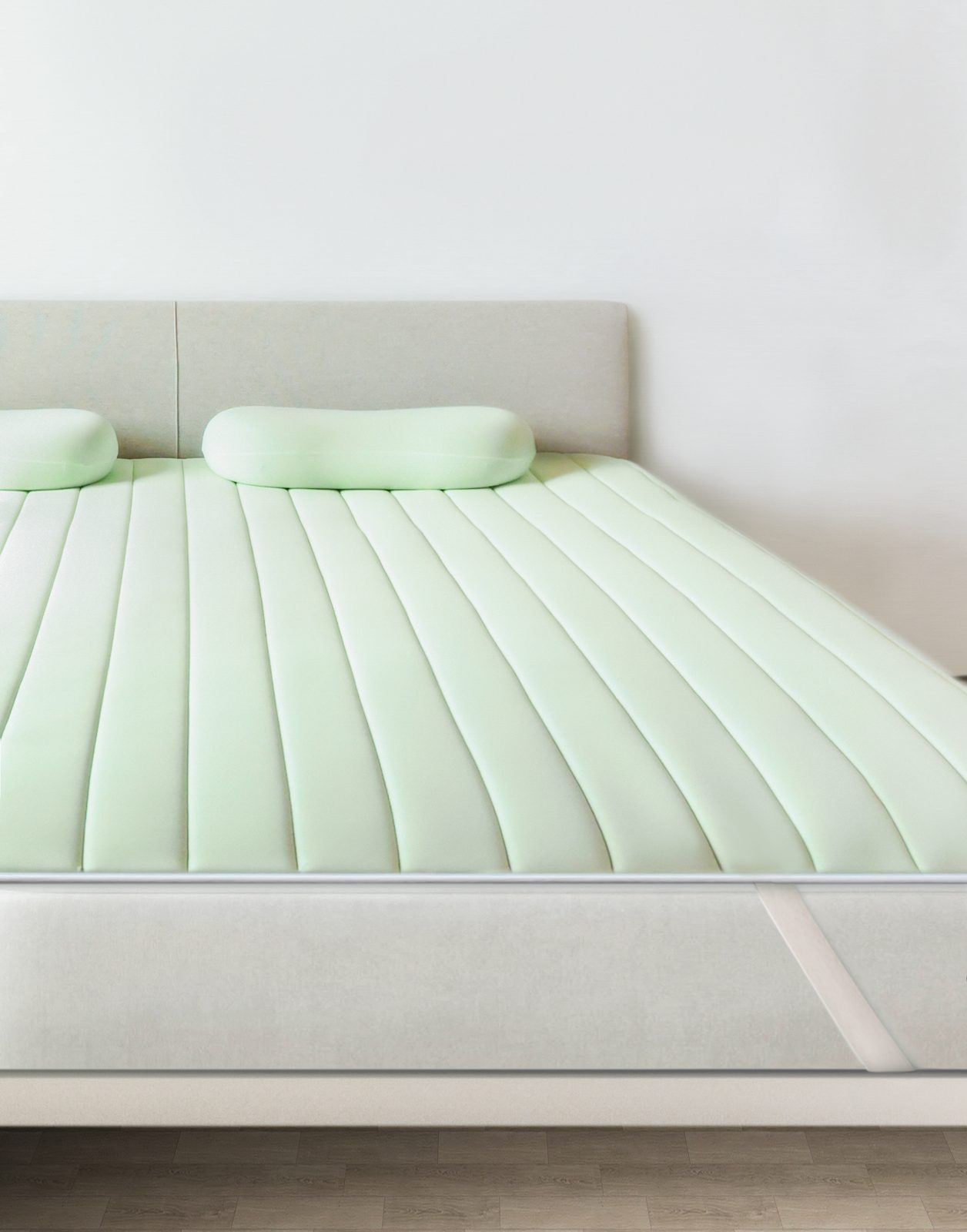
Built with breathable, moisture-wicking fabrics and a cool-to-touch surface. Q-MAX 0.48 certified — meaning it's 20× cooler to the touch than memory foam, and 8× cooler than cotton.
*SGS lab tested results
Cool Mint
Arctic White
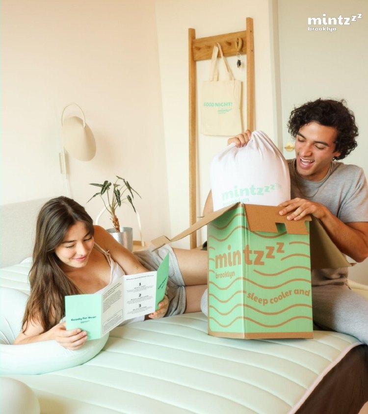
Designed the packaging system end to end. The unboxing is the first physical product experience a customer has with the brand, so I treated it like a small piece of choreography.
Mint waveform print on kraft — friendly, recognizable, recyclable.
The product itself, rolled, in a branded drawstring bag.
"Ready for Bed?" — onboarding leaflet and care card.
A reusable cotton tote so the unboxing leaves something behind.
Marketing videos directed to communicate the three felt qualities of the Chill-Pad — coolness, softness, and breathability — without using a single bullet point.
Cool-to-touch on contact — Q-MAX 0.48 certified.
1.7× smoother than cotton — feels soft right away.
8× more breathable than a foam topper.
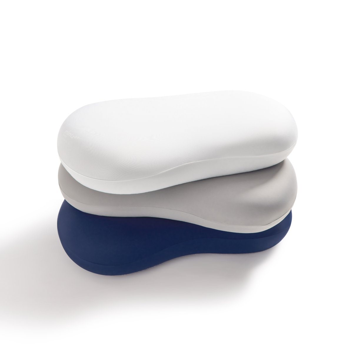
Two colorways, designed to fit any bedroom.
Designed to enhance relaxation and improve sleep quality through gentle, evenly-distributed pressure — like a comforting hug. The perfect breathable, cozy companion for cuddle lovers who run hot.
Throw / Blanket size: 42" × 72"
Each product is an entry point. Each works alone, each reinforces the rest. Same materials family, same mint accent, same promise.
"A perfect gift for summer, so soft and plushy, stays cool and crisp all night."
"I'm a hot and sensitive sleeper, and I've never tried any weighted blankets, but I am very glad I bought this and it truly blew me away."
"Cute pillow — found it pretty functional and helped me stay cool during the night. Wish it came in more colorful prints!"
Real numbers behind any cooling claim — every product is SGS lab tested rather than just marketed as "cool."
No setup, no installation. Strap on the bed in seconds. Roll up to travel. The aim was to reduce the friction of "should I try this tonight?"
A lot of cool-touch fabrics feel synthetic. I spent time tuning the line so the cooling and the softness could coexist.
A quieter, better-designed cool layer than the bedding aisle had really tried for.
3,000+ verified 5-star reviews · 30-night trial · free shipping in the US